Understand and utilize CSS Flexbox for creating flexible and responsive layouts.
By Upingi Team / Tutorial Level: Intermediate
Why Use Flexbox?
CSS Flexbox (Flexible Box Layout Module) provides a more efficient way to lay out, align, and distribute space among items in a container, even when their size is unknown or dynamic.
It makes building complex, responsive layouts much simpler compared to traditional methods like floats.
Prerequisites
- Basic HTML Knowledge: Understanding HTML elements and structure.
- Basic CSS Knowledge: Familiarity with CSS selectors and properties.
Let's flex those layout muscles!
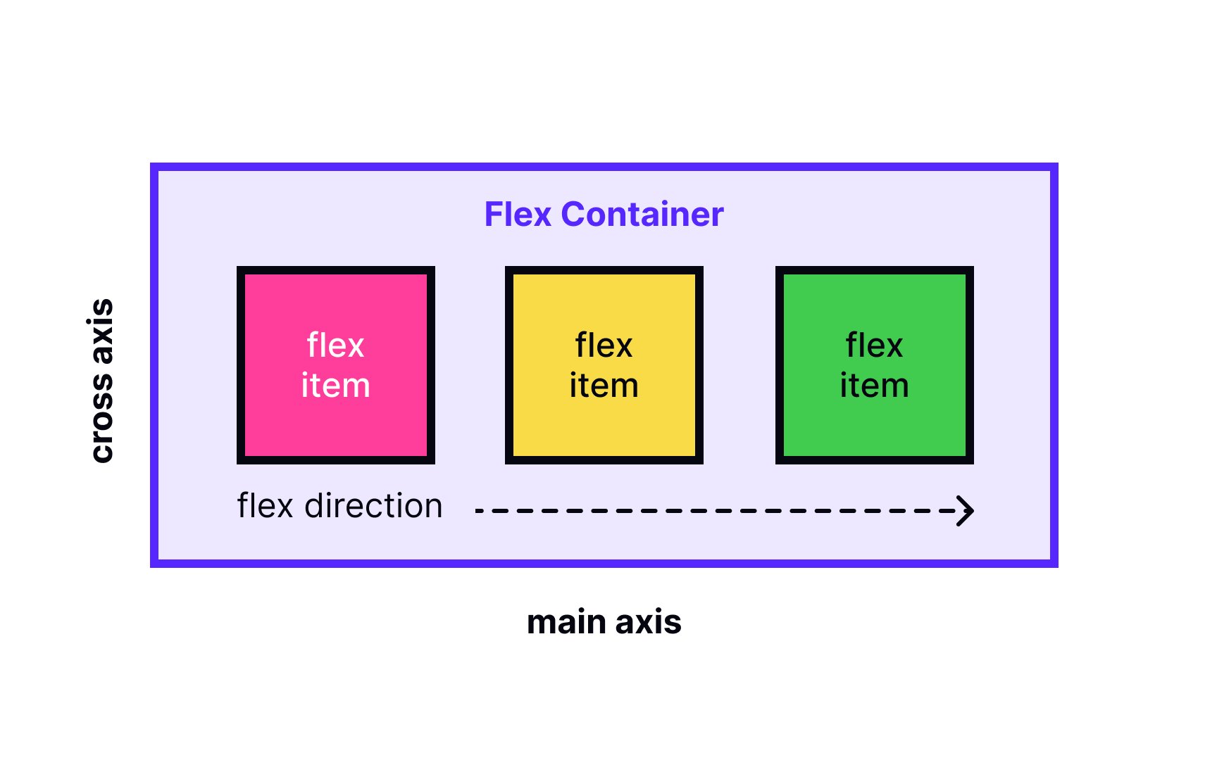
Chapter 1: Creating a Flex Container
Flexbox works by defining a flex container and flex items inside it.
- Enable Flexbox: Apply `display: flex;` or `display: inline-flex;` to the parent element (the container).
- Flex Direction: Control the main axis using `flex-direction: row;` (default), `row-reverse;`, `column;`, or `column-reverse;`.
- Flex Wrap: Allow items to wrap onto multiple lines with `flex-wrap: nowrap;` (default), `wrap;`, or `wrap-reverse;`.
- Justify Content: Align items along the main axis using `justify-content: flex-start;` (default), `flex-end;`, `center;`, `space-between;`, `space-around;`, or `space-evenly;`.
- Align Items: Align items along the cross axis using `align-items: stretch;` (default), `flex-start;`, `flex-end;`, `center;`, or `baseline;`.
Experiment with these properties on a container with several child elements.
Chapter 2: Controlling Flex Items
While container properties manage the overall layout, you can control individual flex items (the direct children of the flex container) using these properties:
- `order`: By default, items are laid out in source order. `order` allows you to change this visually. Items with lower `order` values appear first (default is `0`). Example: `order: -1;` makes an item appear first.
- `flex-grow`: Defines the ability for a flex item to grow if necessary. It accepts a unitless value (default `0`) that serves as a proportion. If all items have `flex-grow: 1;`, the remaining space in the container will be distributed equally. If one item has `flex-grow: 2;` and others have `1`, it will take up twice as much space as the others.
- `flex-shrink`: Defines the ability for a flex item to shrink if necessary (default `1`). If set to `0`, the item will not shrink below its `flex-basis` size. Higher values mean an item will shrink more relative to others.
- `flex-basis`: Defines the default size of an element before the remaining space is distributed. It can be a length (e.g., `20%`, `100px`) or `auto` (default - looks at the item's width or height property).
- `flex`: This is a shorthand for `flex-grow`, `flex-shrink`, and `flex-basis`. The default is `0 1 auto`. Recommended practice is to use this shorthand (e.g., `flex: 1;` which sets grow to 1, shrink to 1, basis to 0%, `flex: auto;` which sets grow to 1, shrink to 1, basis to auto).
- `align-self`: Allows the default alignment (or the one specified by `align-items`) to be overridden for individual flex items. Accepts the same values as `align-items` (`auto`, `flex-start`, `flex-end`, `center`, `baseline`, `stretch`).
Apply these properties to individual items within a flex container to see how they affect layout, growth, and shrinking behavior.
Conclusion & Next Steps
You've learned the core concepts of CSS Flexbox, including container and item properties, enabling you to build flexible layouts.
What to learn next:
- Practice building common UI patterns (navbars, cards, grids) with Flexbox.
- Explore CSS Grid Layout for more complex two-dimensional layouts.
- Combine Flexbox and Grid for powerful layout solutions.
- Understand browser support and prefixes if needed (though largely unnecessary now).